Online marketers don’t mind going out of their ways to make sure significant increases in their conversion rate. They come up with innovative marketing strategies, brilliant campaigns, attractive offers and what not.
It’s no surprise that they have to make all these happen as the online market today is more competitive than the physical one. Due to little to no entry barriers and other external threats, it is getting tougher and tougher to hold on to customers and increase conversion rate.
Regardless of having brilliant campaigns, great products, and efficient strategies, all the efforts can end up in smoke if the website through which you are marketing and selling your product lacks the X-factor. As people never run short on options online, it is a must to have a killer website that will skyrocket your sales.
The question is, how you make that happen.
You might think that your website is okay and you can make it big by implementing marketing strategies. But if you can learn some very simple tweaks, your site will do a lot better regarding conversion rate.
Sometimes marketers just analyze how much revenue their website is generating and stop trying new things. This is not the right way to go with it. Even if you are making just enough profit, you should not stop looking for opportunities to improve and new areas of advantage.
The seven tweaks I am going to discuss in this article would make sure your website is not missing out on potential revenue and customers. You can get a better idea of what your site has got missing and how to fill the gap. Small or significant, regardless of the size of your business, you should not overlook these tweaks.

Effective SEO to Increase Conversion Rate
Sometimes, people start getting immediate success after starting their business online. This might happen for few reasons like active social media presence, lack of competition in the niche, innovative products, etc.
At that point, forgetting about the fundamental thing regarding online business and marketing is not impossible. Search engine optimization is something which should never be overlooked and given proper importance.
The X-factor you have today, might not be there tomorrow. Things like new competitors, new market demographics, and new demands can break things for you.
If you want to keep your profits going, you should let your presence known online. And what other way is better for that than SEO?
You need to make sure that your website is SEO friendly so that the search engines can view your site at the top when people search for relevant niches.
Having a blog alongside your e-commerce site is the best idea to enhance your search engine ranking. Better search engine rankings will bring more traffic to your website, thus increasing the possibilities of more conversion rate.
If you can publish quality blog articles related to your products and their usage, then more people will be interested in purchasing them.
On top of that, those articles should be SEO friendly with proper keywords, META tags, keyword density, and authenticity.
CMS platforms like WordPress already offer a lot of options for content management in SEO friendly way.
Even if you have little to no knowledge in SEO, due to the very nature of the tools and plugins of CMS platforms, you can quickly take care of that and enhance sales numbers at the end of the day. That’s why maintaining your website in CMS platforms is appropriate, preferably WordPress.

Personalized Call-to-action
Even if your website contains the substantial amount of traffic, that does not necessarily mean that you are going to be able to achieve your sales targets if the traffic is not interested in purchasing your products or services. For making that happen, you need to increase conversion rates.
You have to turn the traffic into customers. Though there are many different ways to make it happen, as well as it might happen organically without any effort, Call-to-Action (CTA) is probably the best possible option for among all of them.
According to experts, CTA can convert 42% of the traffic into potential customers. Personalized CTA is more successful in that regard because of its specific approach and nature. It filters the audience and shows them what they want to see.
For instance, if someone found your website searching for weight loss supplements, showing them links or articles about organic food that helps losing weight will not make them interested in purchasing your products. If you can tailor the audience based on their traits and characteristics, you will be more likely to convince them.
Segmentation can be a quite complicated and challenging procedure for efficient use of CTA. Many giants in the online market follow complex technical methods to sort their customers out.
At the initial stage, you can use the fundamental ideas to get your share of the pie. For instance, while running email marketing campaigns, you can easily separate campaigns that would direct paying customers to specific landing pages of your website that will serve their interests and purposes.
When there is a lot of content going around, people don’t want to take the trouble of finding the things they want with their own effort. Spoon-feed them, and you will see increased sales.
Writing Clear headlines
Do you know why CMS platforms including WordPress give so much importance on headings and headline texts?
Because they matter. It does not matter if your page is about an article, a product, the homepage or even a squeeze page, you have to be very specific and intelligent about the headline of it.
People judge books by their covers, and in online, they decide material based upon the headlines you feed them.
When people come to your website, they don’t have all the time in the world to go through the content throughout and then judge if your services are worth purchasing.
Instead, they look for catchy titles and headlines and only then start paying attention. If your headlines are not good enough, the potential traffic will stop bothering about your products and will directly go somewhere else that has more clarity in its messages.
For creating the headlines, first, you need to determine your target audience. Then, with some research, you have to find out their interests and characteristic traits. Then you need to create the headline directly stating what you have to offer and why you deserve to get some attention.
For example, if you are selling weight loss products or supplements, you need to give explicit messages about your products in titles. “Being overweight is bad for your health,” this headline might not look so wrong, but it’s boring regardless. It does not give the viewers any hint whatsoever what are you offering.
Instead, “Want to lose 2 kilograms a month? Look no further”, looks very interesting and compelling. After taking a look at this headline, the audience will be interested how you are planning to help them with their issue and give it a read.

Decluttering Site Navigation
The navigation menu of your website is undoubtedly essential, but you need to make sure that because of them the relevant content you want your target audience to see does not get overlooked. You certainly aspire CTA to be the prime focus of the page.
When the navigation menu is too complicated containing lots of options, the visitors might start visiting them rather than going to pages at which you want them to go.
The critical thing to look for here is the understanding of proper balance. You also don’t want your navigation to run short of options to that extent at which your website looks incomplete. You have to keep all the required elements in the navigation menu which will enable the users to go to whatever page they want.
Minimizing navigation does not necessarily mean to get rid of options. The design of the navigation menu should have the highest priority. It is possible to have designs that will occupy very little space, and would still be enough to satisfy all the necessities of your potential customer.
Using Pop-up Offers
It is another beneficial website tweaking strategy to turn the traffic into customers. You need to remember; this strategy possesses some risks as well. This option needs to be applied very carefully.
If you overdo it, your website will rather lose potential consumers. When the number of pop-up offers is high, people will only get annoyed and will stop visiting your site because nobody wants to see offers without their will again and again.
If possible, you can you use this option through sorting the type of traffic you have. You need to show the audience the kind of pop-up offers they can relate to.
If they get irrelevant pop-up offers, they will not purchase the products you are trying to sell.
You can give promotional codes or generalized offers on all sorts of products if you can’t arrange the elaborate measures required for targeting those offers to a specific group of people.
No one would consider those advertisements as distractions, instead of blessings. You can also ask for their email accounts in return for specific percentages of discounts and then do email marketing.
Make Your Pages Spacious
In what sort of shops you feel more comfortable at? The jammed shop with too many people, little to no space and products hanging at every corner? Or the cozy small shop at the end of the road which is spacious, calm and well decorated?
I would go for the second option any given day, even if the following shop has fewer alternatives for me to choose from.
The same goes for online websites as well. You got to have a substantial amount of empty spaces in your web pages to give the targeted audience some breathing room.
If your page is filled with too many advertisements, article links here and there, product offers at top and bottom, product pictures everywhere and many other unnecessary elements, then the visitors will find it very discomforting for their eyes. Your page looks messy, shabby and ugly.
Having some space on your webpage will enable the visitors to take a look at all the offers you have at the table, all the options you are offering them and many more. You don’t want your audience to miss out on the most exciting products you have to offer, do you?
Increase the number of pages, but don’t make one page too crowded.

Replacing Stock Photos
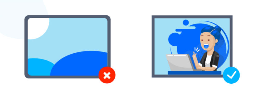
If you want people to purchase something from your website, not from someone else’s, then you should stop using stock photos for introducing your products to the customers.
Stocks photos are good to start your business, and you might not have enough capital to hire professional photographers to take lucrative pictures of your products and introduce them to the customers. But once your business starts to grow, stock photos are not a good option.
Most of the new online businesses rely on stock photos. If you are doing the same, you are not differentiating yourself from them, to begin with. That differentiation matters a lot.
When you have original attractive photos, the potential customers will have a cognitive bias towards your product. Even if you are selling a regular product, they will likely to believe that your product is better than other alternatives because it looks good and different.
As everyone uses stock photos, people stop bothering and don’t look beyond. They wholly think that it doesn’t matter from whom they buy the product.
But you don’t want that to happen, right? You want the potential customers to differentiate and purchase the products from your website over the others.
Don’t Forget Minor Tweaks
Tips mentioned above are major tweaks that will help you to increase the conversion rate you are currently having.
There are many minor tweaks as well that will unmistakably help your cause such as making your content more readable, beautiful color combination, decreasing loading time and displaying guarantees. You should not forget about exploring these options as well.


1 Comment, See all Comments